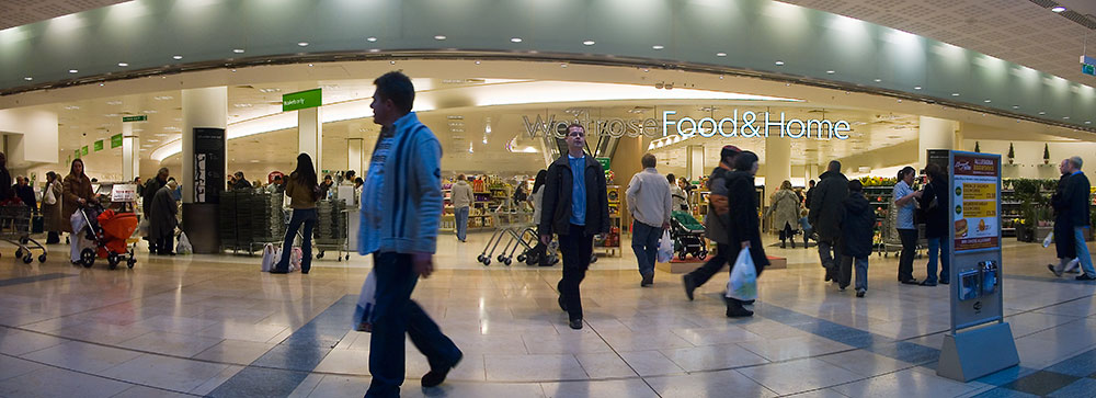
My dislike of 360 degree panoramas printed flat was confirmed by this Unquiet Thames - Crispin Hughes exhibition. I had to explain how they were made to a couple of parents who were telling their small son that they were “fisheye” pictures. I started with the fact that the verticals would be curved as well if they’d been fisheye pictures and wished I hadn’t started. My problem is that I find 360s are just too hard for me to read when presented flat. Maybe it’s just that I’m more used to the cylindrical presentation which is difficult in a gallery context. I prefer it when they are more tableaux-like with people in them, like most of John Brownlow’s here. I’ve unwrapped and printed this 360 of mine but again it has people to hold it together. Without people they seem to descend into not unattractive graphics. The symmetry in the bridges is interesting but the upstream and downstream of the river both going into the picture seems too wrong. JB has an under a bridge shot in the set above but to me it’s the sofa and in the London set, the collected crap, that draws the eye - the part that has the easily read perspective - with the architecture becoming a spectacular framing device. So, worth a look if you’re in the area but I will be sticking to partial panoramas. It was also my first visit to the Museum of London Docklands (it’s been open nearly three years). It had lots of non-functioning technology (like the audio that should have accompanied the panoramas) but since there was much more to look at than I’d expected that didn’t seem to matter.
Old Comments
The comments from the previous WordPress blog.
Michael Abbott: “My problem is that I find 360s are just too hard for me to read when presented flat.”
I think the ones that work in that PDF are the ones where you don’t have to read them, those whose 360-ness isn’t the first thing you notice. I guess this amounts to saying that for them to work as flat pictures, they have to work as flat pictures, rather than forcing you to work at reconstrunting the situation.
Pg 8a, 10a, maybe 9b fall into this category for me, I don’t think they’re great but at least they manage not to shout about being 360. The subject matter seems like it might lend itself to this, although it doesn’t seem to be what he was after.
admin: Hi Michael
Yes, there is lots more positive stuff I could have said but given that I usually write very little and brief text is supposed to be one of the rules of this blog that post seemed long enough as it was. The final page of the PDF has probably my favourite images. The top one has gorgeous colour and good balance between the street level light (Whining again, but I was disappointed that so many had bleached out backgrounds, especially as it’s relatively easy to bracket and merge in Photoshop when shooting like this) and the lower one describes the space well, partly because it effectively breaks into a more manageable diptych of two 180 degree pictures.